


Listening to Users, Mastering Tables, & Overcoming
Suggested Takeaway
- Listening to Users: Sometimes it’s a fight to get to listen to the user, but it is always rewarded. The converse is true as well: if you don’t overcome barriers and listen to the user, you will pay for it with a failed project or a poorly performing app (and you may never even know it).
- Mastering Tables: There lies a chasm between the common table of data and one that is optimized for usability. I have brought the full storehouse of design principles to bear on a plethora of internal workhorse apps for C.R. England. This has brought my skills of presenting data effectively, which I’ve worked at throughout my career, to new heights.
- Overcoming: Without a solid basis for design choices, and the fortitude to overcome obstacles and see the project's vision through to the end, many product design projects would fail.
Project Overview
The trucking business has evolved into a data-driven enterprise. Behind the trucks and truckers are teams of driver managers collecting, analyzing, and acting on all kinds of data on trucks, trailers, drivers, and more. As a commodity business, with low profit margins, the usability of the driver managers’ screens translates into profits or losses. C.R. England put me in charge of user experience and user interface design of The Workbench—a suite of custom-built internal apps used by every department. I designed the user experience from the ground up for dozens of these to assure their success. I restyled the entire workbench, making everybody's workday more efficient and more enjoyable. The branding design concerns were nil, so I was free to optimize usability for those spending long days doing complex tasks on screens full of data. There were lots of tables and forms.
The Problems
Elsewhere I may do case studies of individual projects from The Workbench, but here I want to study these apps as a group to see what lessons can be gleaned from this set of projects in my time at C.R. England.
Three broad categories of challenges in The Workbench were
- User Experience Design
- User Interface Design
- Code Quality
User Experience Design
Many projects were failing. Company-wide, there were complaints about the software development department. Budgets were routinely exceeded and timelines not met. Applications were not hitting the mark and were going unused, or being used, but with much difficulty and dissatisfaction. User experience principles had been so thoroughly ignored, for so long, that most departments had grown cynical, despairing of getting good software from the in-house development department, many seeking other solutions through outsourcing, off-the-shelf products, or even rogue development. These choices would have costly consequences, but they felt they had no other options.
The UX principles which were routinely ignored included
- User-Centered Design
- User Empathy
- User Research
- Logical Information Architecture
- Information Hierarchy and Visual Hierarchy
- Eliminating Ambiguity
- Predictability of Outcome
- Consistency
- Affordance
- Legibility
- Gestalt Principles
User Interface Design
In addition to just looking old, the interface suffered from use of poorly-designed typefaces (only using system fonts) which were not just ugly but impaired legibility and caused fatigue. The poor use of color also impaired legibility and caused fatigue. The injudicious use of white space and alignment hampered comprehension.
Code Quality
If I were to be successful in carrying out my UX/UI goals, implementing style changes Workbench-wide would have to be easy, and I could not put a burdon on the developers to do so. To achieve this, certain aspects of the codebase would need to be revamped and new standards would need to be put in place and followed. Issues hindering this were
- No Style Guide
- Unsemantic Markup
- Superfluous Markup
- Invalid Markup
- Tables Used for Layout
- Use of Inline Styles
- Poor Separation of Markup (Content and Structure) from Presentation.
My Role
As the UI/UX Designer-Developer at C.R. England, in addition to the workbench apps, which was the bulk of my workload, I was responsible for the drivers’ native mobile app, several intranet portals, the public marketing web site, and various special projects like Elite Awards and the Career Portal.
For The Workbench, I was responsible to optimize the user experience and usability of each new app to assure its success. I was also to revamp the UI for all existing apps to improve their usability. As a function of user experience and usability, I was to design and redesign the UIs. The “developer” aspect of my role was the coding of my designs in order to hand off working mockups which were ready to be made dynamic. I was also able to work in the code of existing apps, rewriting some components when needed. I was solely responsible for all CSS. And I was to create the company’s first web style guide.
Timeline
Individual app projects ran anywhere from a few days to a couple of months, working on anywhere from 1-5 concurrently. I continually refined the usability and look of the 100+ app Workbench over my 3-year stint, but a significant revamp was completed after just a few months.
Personas
- Because we were building apps for office staff, computer competence was a given, monitor size was known, environment was a constant.
- Some were power users.
- Most apps were built for career employees who had technical expertise in their field and in-depth knowledge of the tasks they were working. Occasionally, we would build an app that needed a shorter learning curve for quicker onboarding in higher turnover positions, like the Customer Payment Reconciliation app, or for a new program that had to get up and running quickly, like the Elite Awards driver incentive program.
- Some apps would be used by hundreds of people, such as the PTO app for driver managers. Others were for a single employee and a backup, like the Reefer Monitoring app.
- All users of The Workbench were C.R. England employees, thoroughly acquainted with the branding and positioning.
Actions
- Workbench-wide actions included the primary navigation and the sign-in/out screens.
- The actions available in individual apps ran the gamut, including
- Save, Cancel, Reset, Approve, Deny, etc.
- Form-wide
- Single records in a table
- Single fields within a record
- Within modals
- Edit and Delete Records
- Send E-mail
- Save PDF
- View Detail
- Expande/Collapse
- Save, Cancel, Reset, Approve, Deny, etc.
The Solutions
I made a plan from the start to take an incremental approach to the UI revamp of the entire Workbench and to addressing the coding quality issues. I would start evaluating the issues right away, but get a few new projects under my belt first, before I started making sweeping changes. This way, I would be able to get down in the weeds and gain an intimate knowledge of the systems and the users before I made changes I might regret. This would make economical use of my time and would avoid putting users through more jarring changes which would break their confidence in the interface.
The Process
The process for my projects was typically as follows. When I was assigned a new project, I would get briefed by my supervisor, the development director. He would help me identify the resources I would need to learn the business processes involved. I would meet with stakeholders, subject matter experts, then users. If what anyone said, contradicted the goals of the others, I would mediate and facilitate communication until we were all on the same page. I would seek to understand the goals and requirements of the project to the point that I had my own convictions about what we needed to succeed, then I would advocate for that with the necessary parties.
In my meetings with each party, I would pay particular attention to nailing down the criteria on which the success of the project depended and what would be the measurements of success.
The most important interviews were always with the users. I would try to understand their perspective, values, struggles, and goals. I wanted, as much as possible, to become the user. I would at least empathize with them as much as possible. I considered the user interview to be an art in which I would get the user to open up and talk freely. I would hope to get them to reveal those features they wish they could have if they could have anything. I would try to get them to express what mattered to them, and not what they thought they were expected to say. The real skill was to listen to learn, without influencing the outcome (see the Hawthorne effect and the observer-expectancy effect ).
While meeting with the various stakeholders, I would sometimes sketch the concepts I was hearing to confirm my understanding. I might sketch the user flow, the rough layout of a screen or what a particular feature might look like. This would confirm that I was grasping concepts and heading in the right direction, before I invested more time to find out I was wrong.
Then I would begin creating mockups—low-fidelity, wireframes, more detailed, or higher-fidelity—depending on the needs and the schedule. Implementing the research into a particular design solution would usually raise new questions, for which I would seek out answers immediately. I would communicate frequently with the various stakeholders, at the appropriate times, to confirm we were on the right track. I included the developers early and communicated with them often to make sure we were designing something that could be developed on time and on budget, to get their ideas, and to give them a heads up to what was coming. Conversations with developers would frequently reveal obstacles which influenced my design, or add context which would improve the design solution.
Once the design was approved, I would either hand off the static designs with developer notes in a PDF attached to the Jira task, or I would code the HTML/CSS/Javascript and put a link to it in the Jira task, along with developer notes. Coding the screens assured the implementation went smoothly. I would forgo coding when the solution was similar to existing apps or the schedule did not allow.
I would meet with the developers to hand off the project to them, making sure everything was clear to them. I was available to them for questions or changes that arose while they were working.
We would present the app to the stakeholders at every stage of design and development, integrating feedback when possible, or slating other requests for a future phase.
Now let’s address solutions to the 3 areas for which I detailed problems—User Experience Design, User Interface Design, Code Quality.
User Experience Design
Communication
I knew the main reason projects had been failing—people weren’t listening to each other. I made communication about the business goals, what defined success, and what users required part of every project.
Projects had a history before arriving in our department and being assigned to me. They may have just been a concept, a rough description or list of requirements jotted down, or even a rough sketch made before submitting to software development. Other projects had been around the block a few times with any number of contributors, from managers to section chiefs to top executives helping shape the requirements (though users were rarely consulted). Sometimes the specific implementation was dictated, such as “make it like such and such an app, but with this difference.”, while other requestors did not suggest the solution, merely stating the problem, either because they didn’t know where to begin, or because they trusted us use our skills to solve their problem.
I would take ownership of each project I was given. This meant I had to understand the business goals before I could begin and I had to thoroughly understand the user and his concerns, hence the rigorous communication I detailed under Process, above.
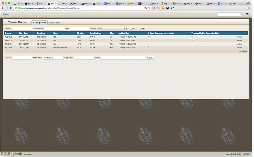
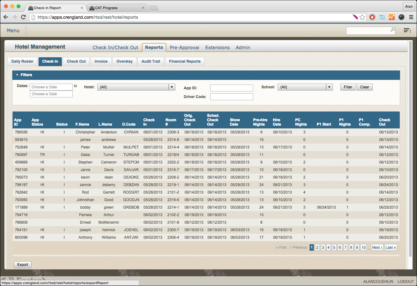
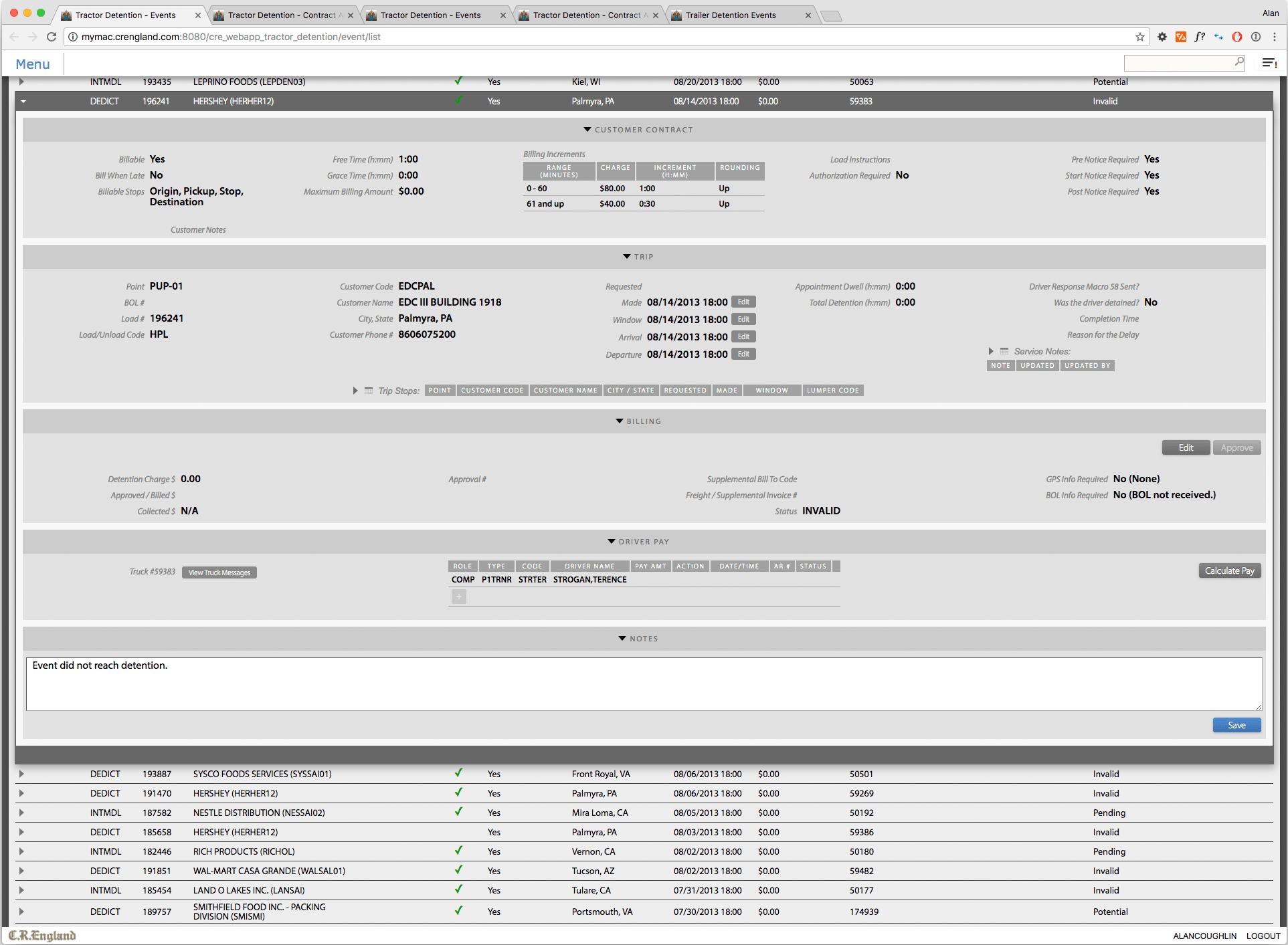
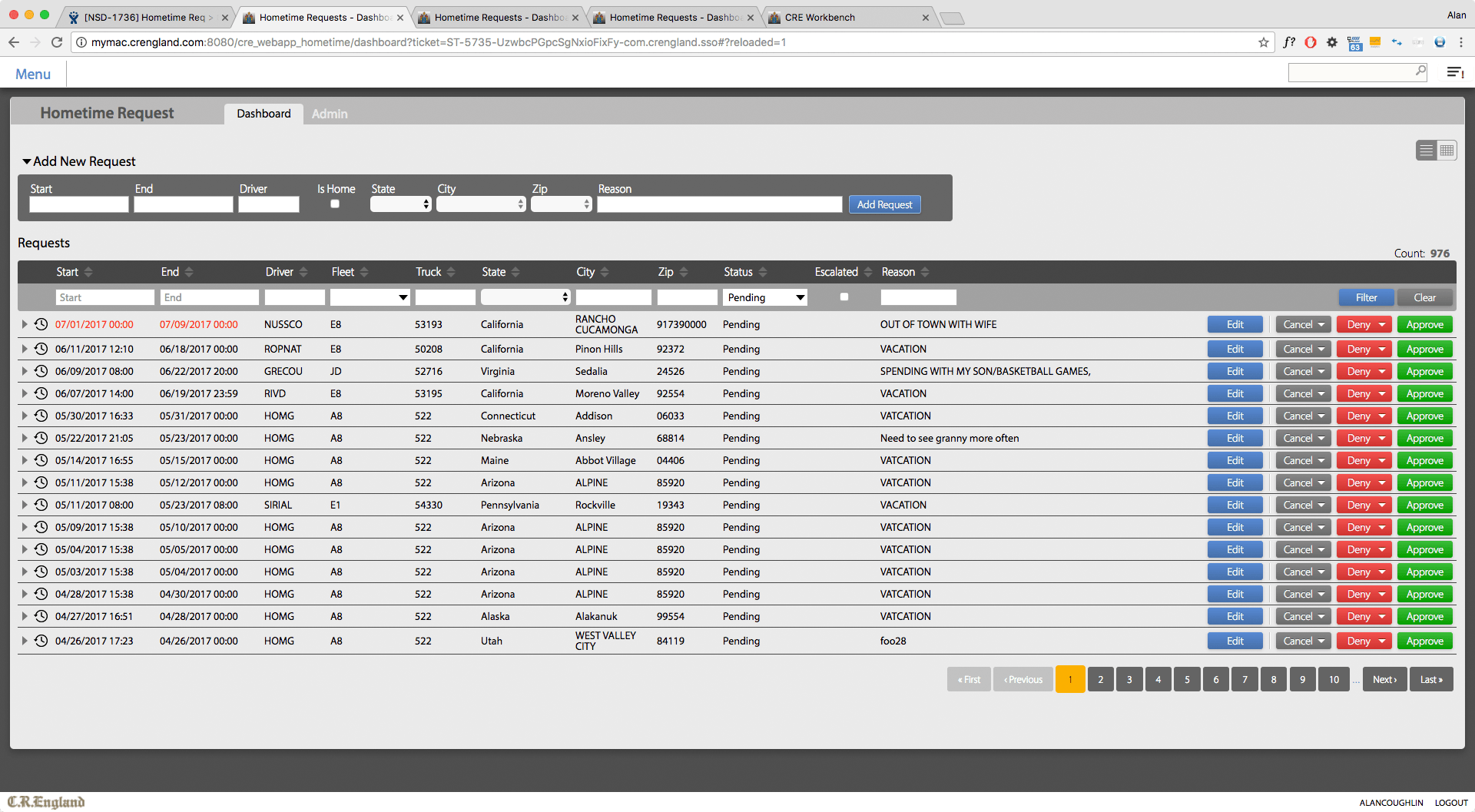
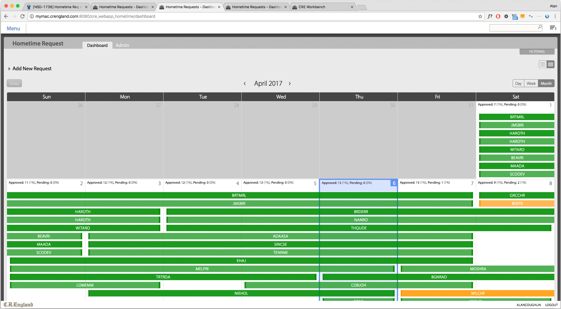
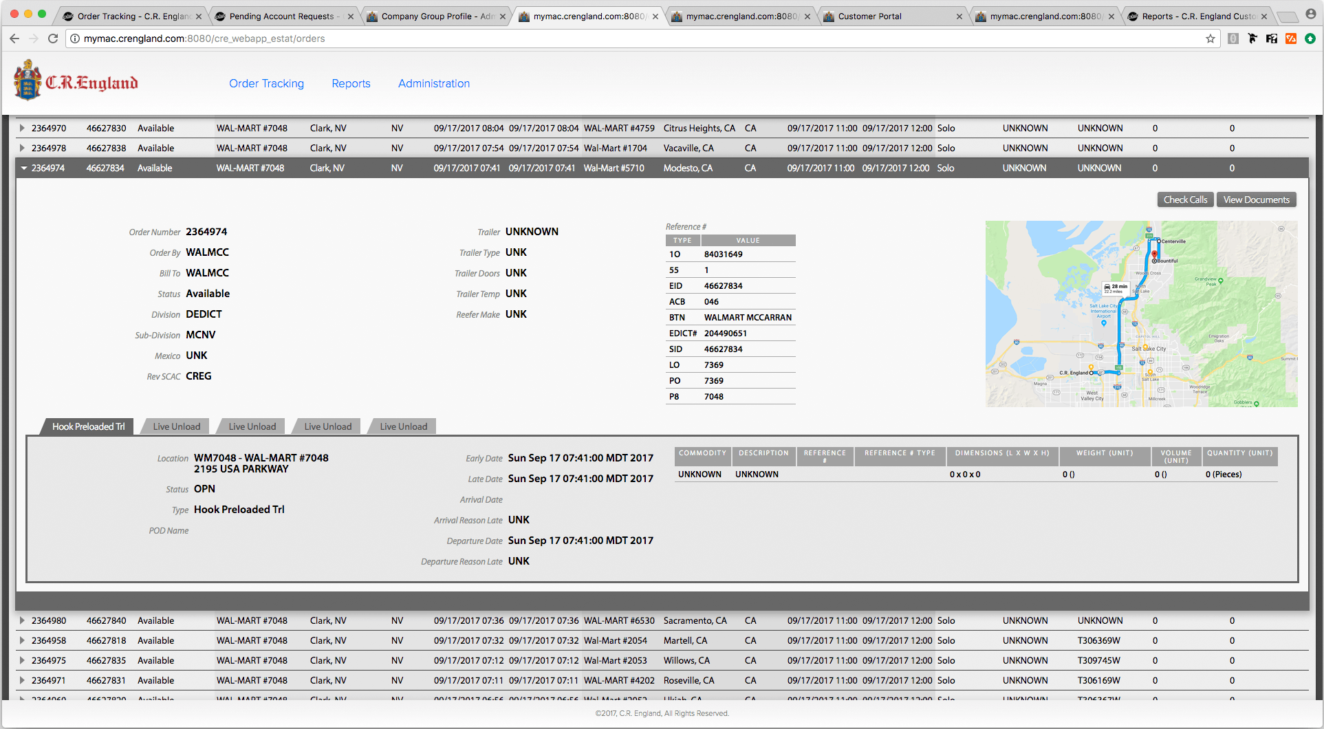
Usable Tables
Of all the interface features and elements on The Workbench to which I applied usability principles, perhaps none were as impactful as the work I did with tables. Tables were used on nearly every screen of every Workbench app and deserved the attention required to optimize their usability, maximize legibility, and minimize fatigue. Many interface elements have their own set of specialized solutions—navigation, modals, text, buttons, icons, forms, tables. Second only to forms, perhaps, are the UX gains to be achieved by skilled table design. Over the 3 years, in which I designed literally hundreds of tables, I was able to hone my skills in the many considerations of data tables, including
- Font
- Row Spacing
- Column Spacing
- Colors
- Row and Column Delimiters
- Sorting
- Filtering
- Grouping
- Subtables
- Pagination
- Expansions
- Detail Panes
- Grids within Detail Panes
- Action Buttons in Rows and Detail Panes
- Responsive Solutions
Just about every usability principle was employed to create tables that were understandable, optimized for the specific task, easy to scan, and could be used all day without tiring.
Early in my career, before the web was, my brother gave me The Visual Display of Quantitative Information by Edward Tufte, the renowned expert in this field. All these years later, after establishing the new design standards for tables at C.R. England, I picked up the book again, and to my surprise, I had faithfully implemented all of its principles (and more) without a conscious thought of it.
Overcoming
There are politics in every organization, and C.R. England is no exception. To assure success for a project, I would have to persevere through to the launch of the app (and sometimes beyond), carrying the vision of the finished product—the vision it needed to succeed—to every individual along the way that could potentially derail the train. This could be the user, who was used to the old way; their manager, who had his own ideas of the problem; my boss, who, at times, didn’t see the point; the developers, who tended to structure the screens from the coding perspective, shaped like the data, or divided by user role; the business analyst, who was often trying to please the strongest political interest; or even an executive with a whim. To give the project its best chance of success, I had to faithfully communicate the consensus of the business requirements and my design solution to whomever needed to hear it. I needed to be patient and respectful. I formed an understanding of the prioritized value of each aspect of the design solution so that I would know which points to yield on and which to go to the mat for. Indeed, I had no authority; I was just a servant. But to be a faithful servant, I needed to make a hearty defense for the essentials for the success of the project. And then, of course, salute and execute.
User Interface Design
The Workbench has its own set of concerns, so it required its own set of design solutions, tailored to those needs. It was a workhorse; it was used, in most cases, all day long and every day, by career office staff at C.R. England. This meant that usability trumped all other concerns, because efficiency, accuracy, and ease-of-use translated into the bottom line. There was virtually no need for branding, none for positioning, nor any other marketing concern. Fonts, colors, spacing, and verbiage could be employed for their utilitarian value.
I chose a color palette which consisted mostly of grays, with carefully calibrated contrasts, aiding the flow of the eyes on the page, and helping clarify relationships and hierarchies. Colors had a big impact against the ubiquitous gray, and were used intentionally and with meaning.
The sizes and spacing of text and other elements take on a different character in the 8th hour of the day, or the 40th hour of the week. Colors and contrasts start to take their toll. All of these were my concerns.
Code Quality
At the start of my time at C.R. England, I assessed the quality of the markup portions of the codebase from a design utility standpoint. I presented my findings to the developers and instructed them on best practices. I reinforced and extended this by highlighting specific issues in our fortnightly dev reviews.
In our dev review meetings, and in conversations with developers individually, I would often teach UX and UI design principles, illustrated in projects we were working on.
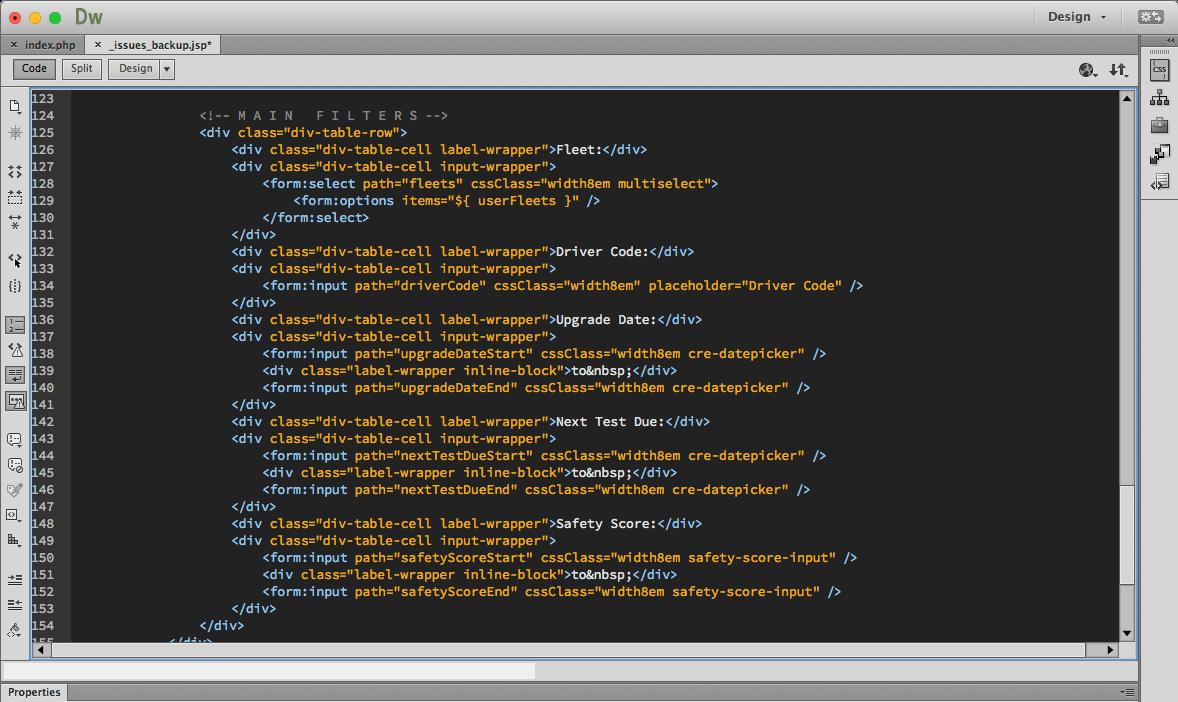
The existing markup and CSS did not follow the principles of separation of markup (content and structure) and presentation. In order to accurately target my styles consistently over the entire Workbench, I had to make some hard decisions about what could be changed and what would have to wait, as I wrote new HTML and CSS and phased out the old.
It was critical to these goals that we have a centralized standard of styles and usage for all to reference. I created the new style guide taking special care not to burden developers with a bunch of noise that they didn’t have time for. I created styles that served the developers, making their jobs easier. I gave them CSS classes in the style guide, as well as code snippets and links to libraries and reference articles, so the style guide could serve them as a repository of valuable time savers. In our dev reviews, I would announce new entries, explaining their value and usage, and answer any questions. The style guide was used and appreciated by all.
I created lessons on CSS and made brown bag presentations to developers, which were very well received.
Results
Over the course of my time at C.R. England, confidence in the software development department improved significantly. More projects hit the mark and achieved business goals. Development time was drastically reduced due to clarity of design goals, implementation of best practices, and availability of developer resources. Users, with whom I had cultivated relationships, expressed that they were more productive and were more satisfied with their jobs. This is what I was working for; this made me very happy.